Monday, August 16, 2010

Sunday, August 8, 2010
Portraits
 My daughters and I at a wedding this past weekend.
  I took this during a hike up a steep mountain. I was standing on a rock behind her.
Sunday, August 1, 2010
Text tool in GIMP
 GIMP doesn't work quite like the photoshop tutorial. I was not able to bevel and emboss. Apparently there is a script I have to download and run in order to use layer styling. I'll work on the script when I get a chance later...
Clone tool
 This is the original photo...
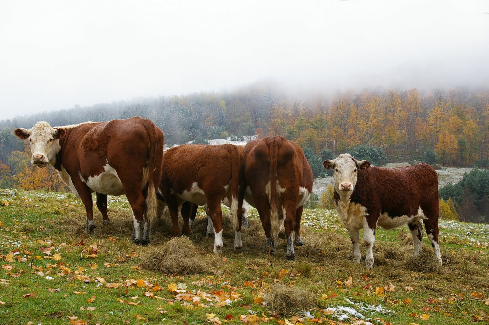 I removed the powerline from the clouds using the clone tool. I cloned the fog and placed it over the powerline. The powerline completely ruined the original photo. Oversight on my part. Good thing for photoshop.
Sunday, July 25, 2010
Dodge, Burn and Filters

 I used the conte crayon filter to make this hunting shack seem a little older than it is.
 I used the paint brush with a very mild opacity to darken the water around the loons and then switched forground colors to white and lightened the loons themselves very slightly. The original picture seemed washed out by the glare of the water. The darkened one helps a little, I think the loons are still hard to see.
 My daughter jumping off of a dock a few years ago. I again used the brush tool to darken the SUV and the trees in the background. I also darkened the dock and her skin and hair a little. I switched to white and lightened the shadows on her skin.
Saturday, July 17, 2010
Photo adjustments...
 Before...
 After... I used Gimp to first cut out the statue and the mountains. I then lightened that layer and left the original sky layer the way it was. I like the sky the way it was but the mountain was too dark for me. I ended up making the sky lighter too just to make it all match.
 Before...
 After... This is a picture of me on my bike. I used hue-saturation to change only the color of the bike. I was impressed how easy this really was once I figured out what everything did. I of course like the original better.
Friday, July 9, 2010
 Attack of the six foot chickens... I took the chick picture this spring in my kitchen and the picture of the store front around the same time in North Conway, NH. I'm sure you can tell I just copied the same chicken multiple times. What I thought was really cool was using layers I could pick which chick was in the fore ground.
 This is a picture of my daughter. She hates this picture because it makes her look funky. I copied each of her eyes first and thought it was cool looking, then when i copied her mouth it just made it hard to look at but still cool.
Thursday, July 1, 2010
Week 6 Landscape
 I took this picture in Pennsylvania last summer. I orientated the shot like this because there was more clutter, (tractors, hay bales, and buildings) than I wanted in the picture. I liked the way the freshly mowed grass created lines and portrait mode seemed to make the picture work better.
 This picture is also from last summer. It is Niagara Falls. I was on a walking path and the trees opened up and this was the view. More of a water scape but I liked the picture, I think it looks like a sink hole in a lake.
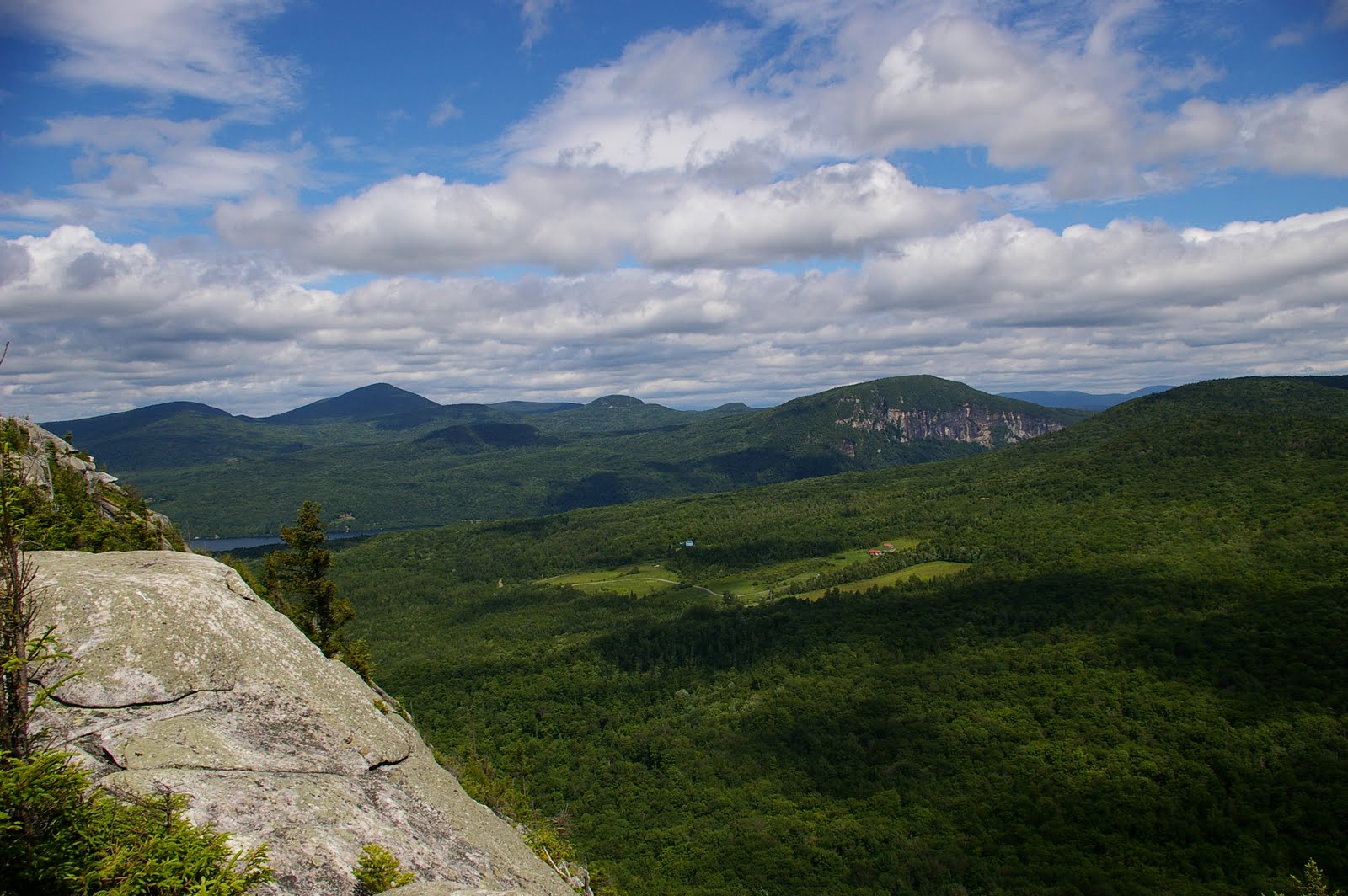 This is Wheeler Mountain, I took this picture this summer. The mountain in the distance is Mt. Pisgah.
  This is Bald Hill Pond in Newark, Vt. I took the picture from my kayak one evening. I like the way Bald Hill reflects on the water.
Thursday, June 24, 2010
Composition- Rule of Thirds


I actually like both pictures, although each in their own way. I like how the way the grass has been mowed adds some shape. This place is called "The Chapel" it is privately owned on Darling Hill in Lyndonville.
Landscape composition
Link
The above link gives a little more detail on composing landscape shots. I like this site as a whole, it is great for beginners and more advanced photographers. They also run photography contests, the one up currently is to travel 10 minutes from your house and photograph something interesting in B&W. There is way too much information to mention here. The site was created by a photography enthusiast, so the articles seem to be written in more laymen's terms, but if you want to get complicated it is there too.
The above link gives a little more detail on composing landscape shots. I like this site as a whole, it is great for beginners and more advanced photographers. They also run photography contests, the one up currently is to travel 10 minutes from your house and photograph something interesting in B&W. There is way too much information to mention here. The site was created by a photography enthusiast, so the articles seem to be written in more laymen's terms, but if you want to get complicated it is there too.
Saturday, June 19, 2010
Week 4 Lighting
 This is Lyndon Institue, the high school I went to in Lyndon Center. I run on the track there most mornings so I brought along the camera one day. The first photo is mid-morning as the fog is trying to burn off.
 45 mins later, after my run, the fog has burned off and there is blue sky and full sun. Everything seems to be more vibrant.
  This was taken at 10pm, the shutter stayed open for 1.5 seconds. I did not bring my tripod only my camera stick. It is very hard to hold still for a second and a half even with the stick.
Wednesday, June 16, 2010
Week 4 Colors and Light
 An example of analogous colors. Yellow, yellow-green and green.
This picture is an example of complimentary colors. It is a green plant next to my old red barn. The red boards seem to make the green plant even more green than you would think.
Wednesday, June 9, 2010
Week 3 Macro Collage

I took hundreds of pictures this week. Most of which were blurry, too dark or not as cool as I thought they would be. I deleted 90% of them and chose these. I especially like my daughters eyeball. I've played around with eyeball shots before, the lighting is key. I also like the Japenese beatle, and the knotted rope. Well I guess I really like all of them. My collage creating skills feel lacking, I'm sure that I can organize better to highlight one photo over another. But for now...
Wednesday, June 2, 2010
Church in Burke Hollow


I ride past this church all the time when I ride my motorcycle. I've always wanted to stop and take it's picture... so today I did.
To change the perspective, I stood in the same spot and only changed the frame from portrait to landscape. I like landscape much better the white church looks better with the trees framing it and the colors in the flag in the front yard. The landscape shot just lets you feel like you are more involved with the scene.
Subscribe to:
Comments (Atom)